Content Spacing
spacing, padding, margins
Spacing & Pacing Guide (Best Practice + Accessibility)
All recommendations below use existing spacing tokens and utilities (e.g., --space-*, in-*, out-*, gap-*)
1) Text blocks (headings, paragraphs, lists)
- Heading - following paragraph: use a smaller gap than body flow (≈ 0.5–0.75 × line-height).
Suggested:out-b-smon the heading orout-t-smon the paragraph. - Paragraph - paragraph: steady reading rhythm (≈ 1 × line-height).
Suggested:out-b-mdon paragraphs (or wrap in a flow container and rely on consistent child spacing). - Lists: space items a bit tighter than paragraphs for easy scanning.
Suggested: list container without-dwn-y-xsto space eachli.
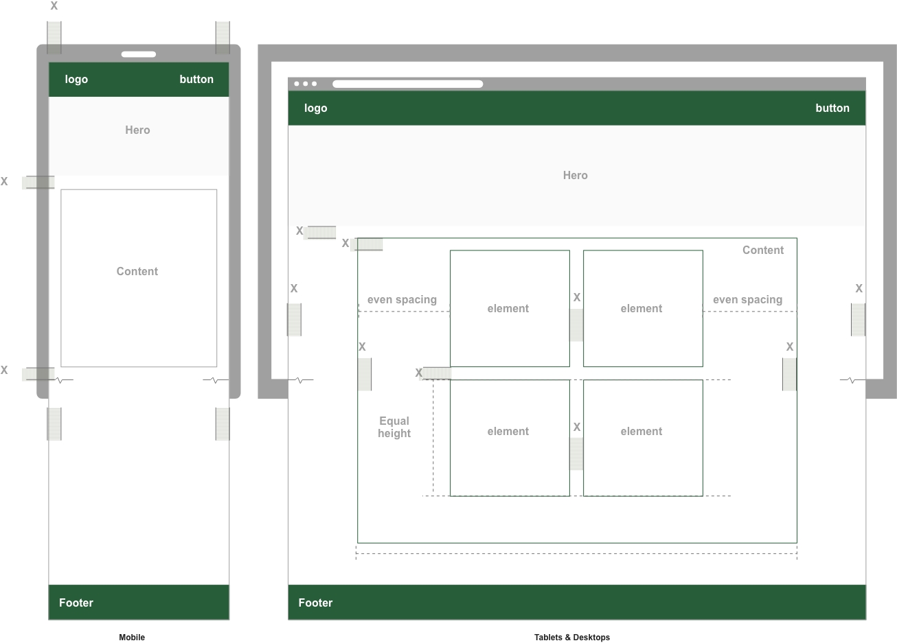
2) Section breaks (rows / banded areas)
- Major section separation: clearly larger than text flow (≈ 2–3 × body line-height).
Suggested: applyin-y-lgto each section band andout-y-xlbetween sections. - Subsections: slightly smaller than major breaks.
Suggested:out-y-lg.
3) Components (cards, panels, buttons)
- Card/panel internal padding: at least one body line-height all around.
Suggested:in-md(compact) orin-lg(comfortable). - Card title - body: follow heading - paragraph spacing.
Suggested:out-b-smon the title. - Buttons (tap target): minimum 44px height equivalent.
Suggested: ensure your button font size + padding yields ≥ 44px; use your existing button classes within-y-xsorin-y-smas needed.
4) Global rhythm (vertical pacing)
- Use the scale consistently:
xxs/xsfor micro-gaps,sm/mdfor text flow,lg/xlfor sections/rows. - Favor tokens over ad-hoc values: keeps pages predictable and easier to maintain.
- Grid gaps: set inter-column/row space with
gap-*matching nearby vertical rhythm (e.g.,gap-mdwhere paragraphs useout-b-md).
5) Accessibility specifics
- Line-height: body copy at or above your default line-height (you already use
--lh-ptokens). - Touch targets: ensure interactive elements meet ≥ 44px in at least one dimension (use existing padding utilities).
- Whitespace helps readability: consistent spacing improves comprehension and focus—don’t compress text blocks too tightly.
6) Practical defaults (drop-in patterns)
- Generic content flow: wrap content in a container and give children a steady rhythm.
Suggested: parent wrapper usesout-dwn-y-md(each child gets a--space-mdtop/bottom gap). - Heading - paragraph:
out-b-smon the heading (orout-t-smon the paragraph). - Paragraph - paragraph:
out-b-mdon the paragraph. - Section/row break:
out-y-xlon the section container; inside, usein-y-lgfor breathing room. - Cards:
in-md(compact) /in-lg(comfortable) + titleout-b-sm. - Grids:
gap-mdfor balanced layouts; scale togap-lgin dense UIs or media-heavy sections.
Summary
Use small gaps (xs/sm) for micro and heading-to-text spacing, medium gaps (md) for paragraph rhythm, and large gaps (lg/xl) for section and row separation. Favor existing tokens/utilities (in-*, out-*, gap-*) for consistency and accessibility.
Element - Recommended Spacing Map
| Element / Context | Recommended Token/Class | Rationale |
|---|---|---|
| Heading - paragraph | out-b-sm (heading) or out-t-sm (paragraph) |
Tighter than paragraph flow; quicker “start reading” cue. |
| Paragraph - paragraph | out-b-md |
Steady reading rhythm (≈ 1 × line-height). |
List items (within ul/ol) |
out-dwn-y-xs on the list |
Compact item separation for scannability. |
| Nested lists | out-dwn-y-xxs on the nested list |
Slightly tighter to show hierarchy. |
| Card/panel padding | in-md (compact) / in-lg (comfortable) |
Breathing room around content without bloat. |
| Card title - body | out-b-sm on the title |
Follows heading-to-paragraph best practice. |
| Buttons (tap target) | Use existing button classes; adjust with in-y-xs/in-y-sm if needed |
Ensure ≥ 44px height for accessibility. |
| Section/row separation | out-y-xl between sections; inside use in-y-lg |
Clear scanning boundaries between content blocks. |
| Generic flow wrapper | out-dwn-y-md on the parent |
Applies a consistent vertical rhythm to children. |
| Grids (cards/images) | gap-md (bump to gap-lg for media-dense) |
Visual balance with nearby text rhythm. |
The design system defines a comprehensive, scalable spacing framework using semantic CSS custom properties (e.g., space-sm, space-lg-fluid) to control all vertical and horizontal rhythm across the UI including padding, margins, and gaps.
Fixed spacing tokens are paired with fluid clamp() based values to adapt responsively across viewports, ensuring consistent proportions from small mobile screens to large desktops. Utility classes like .in-* and .out-* apply these values with clear directional naming (e.g., .in-y-md, .out-x-lg), while cascading classes like .in-dwn-* enable nested spacing for structured layouts.
The system follows modern CSS best practices: it uses relative units (rem, vw) for scalability, avoids magic numbers, and separates layout logic from component styles. From a WCAG perspective, spacing has no strict ratio requirement, but maintaining clear separation between UI elements is critical for visual clarity, focus visibility, and touch targets. Adequate padding and margin help users with cognitive or mobility impairments by reducing visual clutter and improving content legibility.
The spacing utilities are fully compatible with modern browsers and degrade gracefully. All tokens are defined in :root to support overrides (e.g., theming or media queries) and respect the cascading nature of CSS. For optimal accessibility, spacing should be paired with proper focus indicators, semantic structure, and media query breakpoints to preserve usable layout integrity across all devices and assistive technologies.
Browser Support for Fluid Spacing System
| Feature | Support | Notes |
|---|---|---|
| :root Variables | Full | Supported in all major browsers except Internet Explorer. |
| clamp() | Full | Supported in Chrome, Safari, Edge, Firefox since 2020. |
| vw Units | Full | Supported in all major browsers without issues. |
| Fluid Spacing (clamp with vw) | Full | Fully supported in all modern browsers. |
WCAG Accessibility Considerations for Fluid Spacing
| Concern | Status | Notes |
|---|---|---|
| Tap Target Size | Good | Fluid spacing allows padding and margins to support 44px minimum target size (WCAG 2.2 Success Criterion 2.5.8 Target Size). |
| Content Readability | Good | Line-height (~1.5–1.7) and margin space improve paragraph readability and meet minimum 1.5x spacing (WCAG 1.4.12 Text Spacing). |
| Consistent Layout | Good | Predictable and uniform spacing reduces cognitive load for users with disabilities (aligned with WCAG principles of Understandable Content). |
| Responsive Scaling | Good | Spacing scales smoothly across breakpoints, reducing the need for horizontal scrolling and avoiding layout shifts (WCAG 1.4.10 Reflow). |
Internet Explorer Usage Statistics 2025
| Region | IE Market Share | Notes |
|---|---|---|
| Global | 0.16% | IE usage has declined significantly. Source: learn.g2.com |
| United States | 0.09% | IE usage is nearly negligible. Source: gs.statcounter.com |
| Enterprise Networks | Less than 0.5% | Some legacy internal systems still use IE, but rapidly declining. |
| Mobile Devices | 0% | IE was never a standard browser on mobile platforms. |
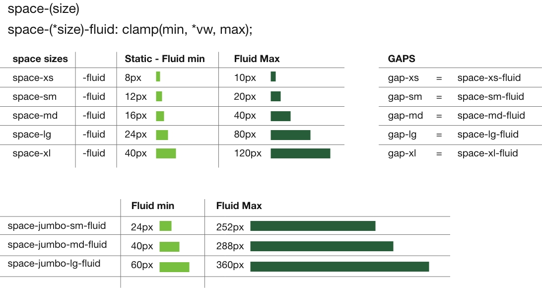
| Variable | Clamp Value | Min (px) | Preferred (px) | Max (px) | Used In |
|---|---|---|---|---|---|
| --space-xxs-fluid | clamp(0.222rem, 0.5vw, 0.333rem); only use when two items (buttons) are next to each other where total spacing add up to (min 8px) for touch content. |
4px | .5vw | 6px | --gap-xxs, .gap-xxs, .v-spacer-xxs |
| --space-xs-fluid | clamp(0.444rem, 1vw, 0.556rem) | 8px | 1vw | 10px | --gap-xs, .gap-xs, .v-spacer-xs |
| --space-sm-fluid | clamp(0.667rem, 2vw, 1.111rem) | 12px | 2vw | 20px | --gap-sm, .gap-sm, .v-spacer-sm |
| --space-md-fluid | clamp(0.889rem, 3vw, 2.222rem) | 16px | 3vw | 40px | --gap-md, .gap-md, .v-spacer-md |
| --space-lg-fluid | clamp(1.333rem, 8vw, 4.444rem) | 23px | 8vw | 80px | --gap-lg, .gap-lg, .v-spacer-lg |
| --space-xl-fluid | clamp(2.222rem, 10vw, 6.666rem) | 40px | 10vw | 120px | --gap-xl, .gap-xl, .v-spacer-xl |
| Root Variable | Type | REM Value | PX Value | Related Fluid Clamp | Used By / Connected To |
|---|---|---|---|---|---|
| --space-xxs | Space | 0.2222rem | 4px | clamp(0.222rem, 0.5vw, 0.333rem); | --gap-xxs, .gap-xxs, .v-spacer-xxs |
| --space-xs | Space | 0.444rem | 8px | clamp(0.444rem, 1vw, 0.556rem) | --gap-xs, .gap-xs, .v-spacer-xs |
| --space-sm | Space | 0.667rem | 12px | clamp(0.667rem, 2vw, 1.111rem) | --gap-sm, .gap-sm, .v-spacer-sm |
| --space-md | Space | 0.889rem | 16px | clamp(0.889rem, 3vw, 2.222rem) | --gap-md, .gap-md, .v-spacer-md |
| --space-lg | Space | 1.333rem | 24px | clamp(1.333rem, 8vw, 4.444rem) | --gap-lg, .gap-lg, .v-spacer-lg |
| --space-xl | Space | 2.222rem | 40px | clamp(2.222rem, 10vw, 6.666rem) | --gap-xl, .gap-xl, .v-spacer-xl |
| --bs-sm | Border | 0.111rem | 2px | clamp(0.111rem, 0.1rem + 0.1vw, 0.166rem) | (General border sizing) |
| --bs-md | Border | 0.222rem | 4px | clamp(0.222rem, 0.2rem + 0.2vw, 0.333rem) | (General border sizing) |
| --bs-lg | Border | 0.333rem | 6px | clamp(0.333rem, 0.3rem + 0.3vw, 0.5rem) | (General border sizing) |
| --radius-sm | Radius | 0.222rem | 4px | — | (Used for small-rounded elements) |
| --radius-md | Radius | 0.444rem | 8px | — | (Used for base-rounded elements) |
| --radius-lg | Radius | 0.555rem | 10px | — | (Used for large-rounded elements) |
| --radius-full | Radius | 9999px | full | — | Used for pills, circles |
Headline - class on parent container: in-dwn-b-sm
in = padding, dwn = child level elements, y = top and bottom, sm = space-sm-fluid
Pad children bottom (sm)
The technology behind modern smartphones has evolved rapidly over the last decade. What was once a basic communication tool has transformed into a powerful pocket-sized computer. With features like facial recognition, AI-driven photography, and real-time language translation, the devices we carry daily are more powerful than the systems used to land humans on the moon.
padding over-ride in-t-lg (padding top (lg)) In the middle of a quiet forest, a small cabin stood alone, surrounded by towering pines and the distant sound of a creek. The air was crisp and filled with the scent of earth and bark. Inside, a fire crackled softly in the hearth while a kettle whistled gently on the stove. For the first time in weeks, Elise felt at peace.
Class on parent container: in-dwn-y-md
in = padding, dwn = child level elements, y = top and bottom, md = space-md-fluid
Adds qual padding to top and bottom of each child.
The technology behind modern smartphones has evolved rapidly over the last decade. What was once a basic communication tool has transformed into a powerful pocket-sized computer. With features like facial recognition, AI-driven photography, and real-time language translation, the devices we carry daily are more powerful than the systems used to land humans on the moon.
padding over-ride .in-lg In the middle of a quiet forest, a small cabin stood alone, surrounded by towering pines and the distant sound of a creek. The air was crisp and filled with the scent of earth and bark. Inside, a fire crackled softly in the hearth while a kettle whistled gently on the stove. For the first time in weeks, Elise felt at peace.
Padding - Margin visual samples
Added media queries for md: lg: xl:
Use filters to reduce visible content and scrolling.
All sides
in-xs
This card uses in-xs to apply padding spacing. This creates space between the content and its surroundings.
in-sm
This card uses in-sm to apply padding spacing. This creates space between the content and its surroundings.
in-md
This card uses in-md to apply padding spacing. This creates space between the content and its surroundings.
in-lg
This card uses in-lg to apply padding spacing. This creates space between the content and its surroundings.
in-xl
This card uses in-xl to apply padding spacing. This creates space between the content and its surroundings.
Top and Bottom
in-y-xs
This card uses in-y-xs to apply padding spacing. This creates space between the content and its surroundings.
in-y-sm
This card uses in-y-sm to apply padding spacing. This creates space between the content and its surroundings.
in-y-md
This card uses in-y-md to apply padding spacing. This creates space between the content and its surroundings.
in-y-lg
This card uses in-y-lg to apply padding spacing. This creates space between the content and its surroundings.
in-y-xl
This card uses in-y-xl to apply padding spacing. This creates space between the content and its surroundings.
Left and Right
in-x-xs
This card uses in-x-xs to apply padding spacing. This creates space between the content and its surroundings.
in-x-sm
This card uses in-x-sm to apply padding spacing. This creates space between the content and its surroundings.
in-x-md
This card uses in-x-md to apply padding spacing. This creates space between the content and its surroundings.
in-x-lg
This card uses in-x-lg to apply padding spacing. This creates space between the content and its surroundings.
in-x-xl
This card uses in-x-xl to apply padding spacing. This creates space between the content and its surroundings.
TOP
in-t-xs
This card uses in-t-xs to apply padding spacing. This creates space between the content and its surroundings.
in-t-sm
This card uses in-t-sm to apply padding spacing. This creates space between the content and its surroundings.
in-t-md
This card uses in-t-md to apply padding spacing. This creates space between the content and its surroundings.
in-t-lg
This card uses in-t-lg to apply padding spacing. This creates space between the content and its surroundings.
in-t-xl
This card uses in-t-xl to apply padding spacing. This creates space between the content and its surroundings.
Bottom
in-b-xs
This card uses in-b-xs to apply padding spacing. This creates space between the content and its surroundings.
in-b-sm
This card uses in-b-sm to apply padding spacing. This creates space between the content and its surroundings.
in-b-md
This card uses in-b-md to apply padding spacing. This creates space between the content and its surroundings.
in-b-lg
This card uses in-b-lg to apply padding spacing. This creates space between the content and its surroundings.
in-b-xl
This card uses in-b-xl to apply padding spacing. This creates space between the content and its surroundings.
Left
in-l-xs
This card uses in-l-xs to apply padding spacing. This creates space between the content and its surroundings.
in-l-sm
This card uses in-l-sm to apply padding spacing. This creates space between the content and its surroundings.
in-l-md
This card uses in-l-md to apply padding spacing. This creates space between the content and its surroundings.
in-l-lg
This card uses in-l-lg to apply padding spacing. This creates space between the content and its surroundings.
in-l-xl
This card uses in-l-xl to apply padding spacing. This creates space between the content and its surroundings.
Right
in-r-xs
This card uses in-r-xs to apply padding spacing. This creates space between the content and its surroundings.
in-r-sm
This card uses in-r-sm to apply padding spacing. This creates space between the content and its surroundings.
in-r-md
This card uses in-r-md to apply padding spacing. This creates space between the content and its surroundings.
in-r-lg
This card uses in-r-lg to apply padding spacing. This creates space between the content and its surroundings.
in-r-xl
This card uses in-r-xl to apply padding spacing. This creates space between the content and its surroundings.
Use filters to reduce visible content and scrolling.
All sides
out-xs
This card uses out-xs to apply margin spacing. This creates space between the content and its surroundings.
out-sm
This card uses out-sm to apply margin spacing. This creates space between the content and its surroundings.
out-md
This card uses out-md to apply margin spacing. This creates space between the content and its surroundings.
out-lg
This card uses out-lg to apply margin spacing. This creates space between the content and its surroundings.
out-xl
This card uses out-xl to apply margin spacing. This creates space between the content and its surroundings.
Top and Bottom
out-y-xs
This card uses out-y-xs to apply margin spacing. This creates space between the content and its surroundings.
out-y-sm
This card uses out-y-sm to apply margin spacing. This creates space between the content and its surroundings.
out-y-md
This card uses out-y-md to apply margin spacing. This creates space between the content and its surroundings.
out-y-lg
This card uses out-y-lg to apply margin spacing. This creates space between the content and its surroundings.
out-y-xl
This card uses out-y-xl to apply margin spacing. This creates space between the content and its surroundings.
Left and Right
out-x-xs
This card uses out-x-xs to apply margin spacing. This creates space between the content and its surroundings.
out-x-sm
This card uses out-x-sm to apply margin spacing. This creates space between the content and its surroundings.
out-x-md
This card uses out-x-md to apply margin spacing. This creates space between the content and its surroundings.
out-x-lg
This card uses out-x-lg to apply margin spacing. This creates space between the content and its surroundings.
out-x-xl
This card uses out-x-xl to apply margin spacing. This creates space between the content and its surroundings.
Top
out-t-xs
This card uses out-t-xs to apply margin spacing. This creates space between the content and its surroundings.
out-t-sm
This card uses out-t-sm to apply margin spacing. This creates space between the content and its surroundings.
out-t-md
This card uses out-t-md to apply margin spacing. This creates space between the content and its surroundings.
out-t-lg
This card uses out-t-lg to apply margin spacing. This creates space between the content and its surroundings.
out-t-xl
This card uses out-t-xl to apply margin spacing. This creates space between the content and its surroundings.
Bottom
out-b-xs
This card uses out-b-xs to apply margin spacing. This creates space between the content and its surroundings.
out-b-sm
This card uses out-b-sm to apply margin spacing. This creates space between the content and its surroundings.
out-b-md
This card uses out-b-md to apply margin spacing. This creates space between the content and its surroundings.
out-b-lg
This card uses out-b-lg to apply margin spacing. This creates space between the content and its surroundings.
out-b-xl
This card uses out-b-xl to apply margin spacing. This creates space between the content and its surroundings.
Left
out-l-xs
This card uses out-l-xs to apply margin spacing. This creates space between the content and its surroundings.
out-l-sm
This card uses out-l-sm to apply margin spacing. This creates space between the content and its surroundings.
out-l-md
This card uses out-l-md to apply margin spacing. This creates space between the content and its surroundings.
out-l-lg
This card uses out-l-lg to apply margin spacing. This creates space between the content and its surroundings.
out-l-xl
This card uses out-l-xl to apply margin spacing. This creates space between the content and its surroundings.
Right
out-r-xs
This card uses out-r-xs to apply margin spacing. This creates space between the content and its surroundings.
out-r-sm
This card uses out-r-sm to apply margin spacing. This creates space between the content and its surroundings.
out-r-md
This card uses out-r-md to apply margin spacing. This creates space between the content and its surroundings.
out-r-lg
This card uses out-r-lg to apply margin spacing. This creates space between the content and its surroundings.
out-r-xl
This card uses out-r-xl to apply margin spacing. This creates space between the content and its surroundings.
Use filters to reduce visible content and scrolling.
All sides
in-jumbo-sm
This card uses in-jumbo-sm to apply padding spacing. This creates space between the content and its surroundings.
in-jumbo-md
This card uses in-jumbo-md to apply padding spacing. This creates space between the content and its surroundings.
in-jumbo-lg
This card uses in-jumbo-lg to apply padding spacing. This creates space between the content and its surroundings.
Top and Bottom
in-jumbo-y-sm
This card uses in-jumbo-y-sm to apply padding spacing. This creates space between the content and its surroundings.
in-jumbo-y-md
This card uses in-jumbo-y-md to apply padding spacing. This creates space between the content and its surroundings.
in-jumbo-y-lg
This card uses in-jumbo-y-lg to apply padding spacing. This creates space between the content and its surroundings.
Left and Right
in-jumbo-x-sm
This card uses in-jumbo-x-sm to apply padding spacing. This creates space between the content and its surroundings.
in-jumbo-x-md
This card uses in-jumbo-x-md to apply padding spacing. This creates space between the content and its surroundings.
in-jumbo-x-lg
This card uses in-jumbo-x-lg to apply padding spacing. This creates space between the content and its surroundings.
Top
in-jumbo-t-sm
This card uses in-jumbo-t-sm to apply padding spacing. This creates space between the content and its surroundings.
in-jumbo-t-md
This card uses in-jumbo-t-md to apply padding spacing. This creates space between the content and its surroundings.
in-jumbo-t-lg
This card uses in-jumbo-t-lg to apply padding spacing. This creates space between the content and its surroundings.
Bottom
in-jumbo-b-sm
This card uses in-jumbo-b-sm to apply padding spacing. This creates space between the content and its surroundings.
in-jumbo-b-md
This card uses in-jumbo-b-md to apply padding spacing. This creates space between the content and its surroundings.
in-jumbo-b-lg
This card uses in-jumbo-b-lg to apply padding spacing. This creates space between the content and its surroundings.
Left
in-jumbo-l-sm
This card uses in-jumbo-l-sm to apply padding spacing. This creates space between the content and its surroundings.
in-jumbo-l-md
This card uses in-jumbo-l-md to apply padding spacing. This creates space between the content and its surroundings.
in-jumbo-l-lg
This card uses in-jumbo-l-lg to apply padding spacing. This creates space between the content and its surroundings.
Right
in-jumbo-r-sm
This card uses in-jumbo-r-sm to apply padding spacing. This creates space between the content and its surroundings.
in-jumbo-r-md
This card uses in-jumbo-r-md to apply padding spacing. This creates space between the content and its surroundings.
in-jumbo-r-lg
This card uses in-jumbo-r-lg to apply padding spacing. This creates space between the content and its surroundings.
Use filters to reduce visible content and scrolling.
All sides
out-jumbo-sm
This card uses out-jumbo-sm to apply margin spacing. This creates space between the content and its surroundings.
out-jumbo-md
This card uses out-jumbo-md to apply margin spacing. This creates space between the content and its surroundings.
out-jumbo-lg
This card uses out-jumbo-lg to apply margin spacing. This creates space between the content and its surroundings.
Top and Bottom
out-jumbo-y-sm
This card uses out-jumbo-y-sm to apply margin spacing. This creates space between the content and its surroundings.
out-jumbo-y-md
This card uses out-jumbo-y-md to apply margin spacing. This creates space between the content and its surroundings.
out-jumbo-y-lg
This card uses out-jumbo-y-lg to apply margin spacing. This creates space between the content and its surroundings.
Left and Right
out-jumbo-x-sm
This card uses out-jumbo-x-sm to apply margin spacing. This creates space between the content and its surroundings.
out-jumbo-x-md
This card uses out-jumbo-x-md to apply margin spacing. This creates space between the content and its surroundings.
out-jumbo-x-lg
This card uses out-jumbo-x-lg to apply margin spacing. This creates space between the content and its surroundings.
Top
out-jumbo-t-sm
This card uses out-jumbo-t-sm to apply margin spacing. This creates space between the content and its surroundings.
out-jumbo-t-md
This card uses out-jumbo-t-md to apply margin spacing. This creates space between the content and its surroundings.
out-jumbo-t-lg
This card uses out-jumbo-t-lg to apply margin spacing. This creates space between the content and its surroundings.
Bottom
out-jumbo-b-sm
This card uses out-jumbo-b-sm to apply margin spacing. This creates space between the content and its surroundings.
out-jumbo-b-md
This card uses out-jumbo-b-md to apply margin spacing. This creates space between the content and its surroundings.
out-jumbo-b-lg
This card uses out-jumbo-b-lg to apply margin spacing. This creates space between the content and its surroundings.
Left
out-jumbo-l-sm
This card uses out-jumbo-l-sm to apply margin spacing. This creates space between the content and its surroundings.
out-jumbo-l-md
This card uses out-jumbo-l-md to apply margin spacing. This creates space between the content and its surroundings.
out-jumbo-l-lg
This card uses out-jumbo-l-lg to apply margin spacing. This creates space between the content and its surroundings.
Right
out-jumbo-r-sm
This card uses out-jumbo-r-sm to apply margin spacing. This creates space between the content and its surroundings.
out-jumbo-r-md
This card uses out-jumbo-r-md to apply margin spacing. This creates space between the content and its surroundings.
out-jumbo-r-lg
This card uses out-jumbo-r-lg to apply margin spacing. This creates space between the content and its surroundings.
Fluid Margin & Padding Helpers
See Grid and flex classes for layout. Containers (.container-*) set page width only and should not alter margins or padding. Use the spacing utilities below for consistent rhythm. Gaps are updated to --gap-* and .gap-*.
:root {

  /* ----------------------------------- PADDING & MARGINS -------------------- */
  --space-xxs: 0.222rem; /* 4px — only use when two items together sum to ≥ 8px */
  --space-xs:  0.444rem; /* 8px */
  --space-sm:  0.667rem; /* 12px */
  --space-md:  0.889rem; /* 16px */
  --space-lg:  1.333rem; /* 24px */
  --space-xl:  2.222rem; /* 40px */

  /* ----------------------------------- Fluid spacing tokens ---------------- */
  --space-xxs-fluid: clamp(0.222rem, 0.5vw, 0.333rem); /* ~4–6px */
  --space-xs-fluid:  clamp(0.444rem, 1vw, 0.556rem);   /* ~8–10px */
  --space-sm-fluid:  clamp(0.667rem, 2vw, 1.111rem);   /* ~12–20px */
  --space-md-fluid:  clamp(0.889rem, 3vw, 2.222rem);   /* ~16–40px */
  --space-lg-fluid:  clamp(1.333rem, 8vw, 4.444rem);   /* ~24–80px */
  --space-xl-fluid:  clamp(2.222rem, 10vw, 6.666rem);  /* ~40–120px */

  /* ----------------------------------- Jumbo (padding only) ---------------- */
  --space-jumbo-sm-fluid: clamp(1.333rem, 14vw, 14rem);
  --space-jumbo-md-fluid: clamp(2.222rem, 16vw, 16rem);
  --space-jumbo-lg-fluid: clamp(3.333rem, 25vw, 20rem);

  /* ----------------------------------- Gap tokens (UPDATED) ---------------- */
  --gap-xs: var(--space-xs-fluid);
  --gap-sm: var(--space-sm-fluid);
  --gap-md: var(--space-md-fluid);
  --gap-lg: var(--space-lg-fluid);
  --gap-xl: var(--space-xl-fluid);
}

/* ****************************************** SPACING *************************
Add space between sections with vertical spacers.
**************************************************************************** */

<div class="v-spacer-sm" aria-hidden="true" role="presentation"></div>

.v-spacer-xxs { height: var(--space-xxs-fluid); }
.v-spacer-xs  { height: var(--space-xs-fluid); }
.v-spacer-sm  { height: var(--space-sm-fluid); }
.v-spacer-md  { height: var(--space-md-fluid); }
.v-spacer-lg  { height: var(--space-lg-fluid); }
.v-spacer-xl  { height: var(--space-xl-fluid); }

------------------------------- Examples: padding and margin helpers

in = padding
out = margins

• .out-lg       (add large margin on all sides)
• .in-sm        (add small padding on all sides)

• .out-y-lg     (add large margin to top & bottom)
• .in-x-sm      (add small padding to left & right)

• .in-x-dwn-sm  (add small left/right padding to child elements)
• .out-dwn-lg   (add large margins to child elements)

--------------------------------------------------------------------------------
Note: Padding utilities do not auto-clear existing padding. Use .in-stop to cancel.
--------------------------------------------------------------------------------

Class extensions

dwn  = cascade to child elements
dwn2 = cascade to grandchildren (skip a level)

• in-Ax-dwn-*   add padding to child elements
• out-Ax-dwn-*  add margin(s) to child elements

* = size options
Use size to define the space: xxs, xs, sm, md, lg, xl
(Use xxs only when adjacent items together total ≥ 8px)

Ax = axis options
y = top & bottom
x = left & right
l = left
r = right
t = top
b = bottom

-- extended size options — jumbo (padding only)
in-jumbo-Ax-*
 * = jumbo sizes: sm, md, lg
Example: .in-jumbo-y-sm  (add small jumbo padding to top and bottom)

Note — there are no jumbo margin classes.

--------------------------
To remove inherited padding from a child use:
class="in-stop"

Or override with a different .in-* utility on that element directly.
--------------------------

General guidance
- Use .v-spacer-* to create space between sections.
- Prefer padding (in-*) for internal spacing; use margins (out-*) to separate blocks.
- hr elements can have margin classes; padding is not recommended:
  <hr class="out-y-lg" aria-hidden="true" role="presentation">
- As an alternative spacer:
  <div class="v-spacer-lg" aria-hidden="true" role="presentation"></div>
- Standard line breaks <br> are for inline content only.