Images
sizes - best practice
Image Tag vs. Background Image — Accessibility Comparison
| Feature | Using <img> (Recommended) | Using background-image (Limited) |
|---|---|---|
| Semantic | <img> is a semantic HTML element recognized by screen readers | background-image is CSS only; screen readers ignore it |
| Alt text | Supports alt text (alt="description") or alt="" for decorative images | No way to describe image to assistive tech |
| Keyboard focus / ARIA | Can be focused or labeled with ARIA roles | Cannot be focused or described semantically |
| Responsiveness | Use srcset, sizes, or <picture> for responsive performance | Requires media queries and extra CSS; harder to manage |
When to Use background-image
| Use Case | Preferred Method |
|---|---|
| Informative image (conveys content) | <img> with alt text |
| Decorative image (purely aesthetic) | background-image with aria-hidden="true" on container |
| Responsive media | <picture> or <img srcset> |
| Pattern, texture, or layout effect | background-image via CSS |
Best Practices for Image Sizing
| Principle | Best Practice |
|---|---|
| Responsive sizes | Use max-width: 100%; height: auto; |
| Avoid fixed sizes | Use % or rem units instead of hardcoded pixel sizes |
| Correct resolution | Use srcset or sizes for higher-res on retina displays |
| Compression | Use optimized image formats (WebP, AVIF, JPEG) |
| Zoom and scaling | Test at 200% browser zoom for WCAG 1.4.4 and 1.4.10 |
| Alt text | Always provide alt="", or describe if relevant |
| Text in images | Avoid. Use HTML text for scalability and accessibility |
Common Sizing Options by Use Case
| Use Case | Recommended Width | Notes |
|---|---|---|
| Hero Image | 1200–2000px | Full-width desktop view; use srcset or <picture> |
| Mobile Hero | 600–800px | Responsive fallback for smaller viewports |
| Content Image | 300–800px | Scale to column width; use max-width: 100% |
| Thumbnail / Icon | 64–240px | Use SVG if possible; consistent sizing for UI elements |
| Card Image | 250–400px | Use aspect-ratio + object-fit: cover |
| Gallery Image | 150–600px (grid) | Responsive grid using auto-fit or minmax() |
| Background Image | Up to 2000px | Use for decoration only; compress for performance |
| Logo (inline) | 150–300px | Use high-res PNG or SVG for sharpness and accessibility |
Hero, Card, and Gallery Best Practice Breakdown
| Device | Recommended Width | Notes |
|---|---|---|
| Desktop | 1200–2000px | High-resolution, spans full viewport |
| Tablet | 800–1200px | Scales based on content area |
| Mobile | 600–800px | Use compressed variant or different crop |
Card Images
| Usage | Width | Notes |
|---|---|---|
| Standard | 250–400px | Use width: 100% inside card container |
| Aspect Ratio | 4:3 or 16:9 | Use aspect-ratio and object-fit for consistency |
| Height | auto or fixed with aspect-ratio | Avoid distortion from manual height setting |
Gallery Images
| Grid Columns | Image Width | Notes |
|---|---|---|
| 2 columns | 600px max | Use for higher-detail image sets |
| 3–4 columns | 300–400px | Balanced visual layout |
| 5–6 columns | 150–250px | Best for thumbnails and previews |
Hero Image Table
| Feature | Best Practice | Accessibility Notes |
|---|---|---|
| Usage | Full-width, high-impact image at top of page or section | Should support semantic meaning if content-related |
| Recommended Width | 1200–2000px (desktop), 600–800px (mobile) | Use responsive loading with <picture> or srcset |
| Aspect Ratio | 16:9 or auto height based on content | Ensure image doesn’t crop out critical content on smaller screens |
| HTML Method | <picture> or <img> with srcset | Include descriptive alt text if image conveys meaning |
| Decorative Option | background-image via CSS | Only use if purely decorative; must not convey meaningful content |
| Responsive | Use max-width: 100%; height: auto; | Respects user zoom and screen resizing (WCAG 1.4.4, 1.4.10) |
Card Image Table
| Feature | Best Practice | Accessibility Notes |
|---|---|---|
| Usage | Visual support inside cards (e.g., blog, product, profile) | Should have meaningful alt text if relevant to the card's content |
| Recommended Width | 250–400px | Use width: 100% inside the card layout |
| Aspect Ratio | 4:3 or 16:9 using aspect-ratio | Maintains visual consistency across cards |
| Fit Method | object-fit: cover; | Prevents distortion, crops from center by default |
| Performance | loading="lazy" on <img> | Improves performance and user experience on scroll |
| Responsiveness | max-width: 100%; height: auto; | Ensures images scale appropriately with card container |
Gallery Image Table
| Feature | Best Practice | Accessibility Notes |
|---|---|---|
| Usage | Photo grids, image collections, lightbox previews | Use meaningful alt text or aria-hidden="true" if decorative |
| Recommended Width | 150–600px depending on number of columns | Use CSS grid to manage layout and spacing |
| Grid Columns | 2–6 columns using auto-fit or minmax | Ensures adaptable layouts across screen sizes |
| Aspect Ratio | 1:1 square or auto | Use aspect-ratio and object-fit to standardize thumbnails |
| Performance | Use loading="lazy" and srcset | Loads smaller thumbnails initially; link to full-size for details |
Summary Table: Image Sizing by Type
| Image Type | Width | Aspect Ratio | Alt Text | Responsive Handling |
|---|---|---|---|---|
| Hero | 1200–2000px | 16:9 or fluid | Yes if content-related | <picture> or srcset |
| Card | 250–400px | 4:3 or 16:9 | Yes if relevant | width: 100%; height: auto; |
| Gallery | 150–600px | 1:1 or auto | Yes or aria-hidden if decorative | CSS Grid + object-fit + lazy loading |
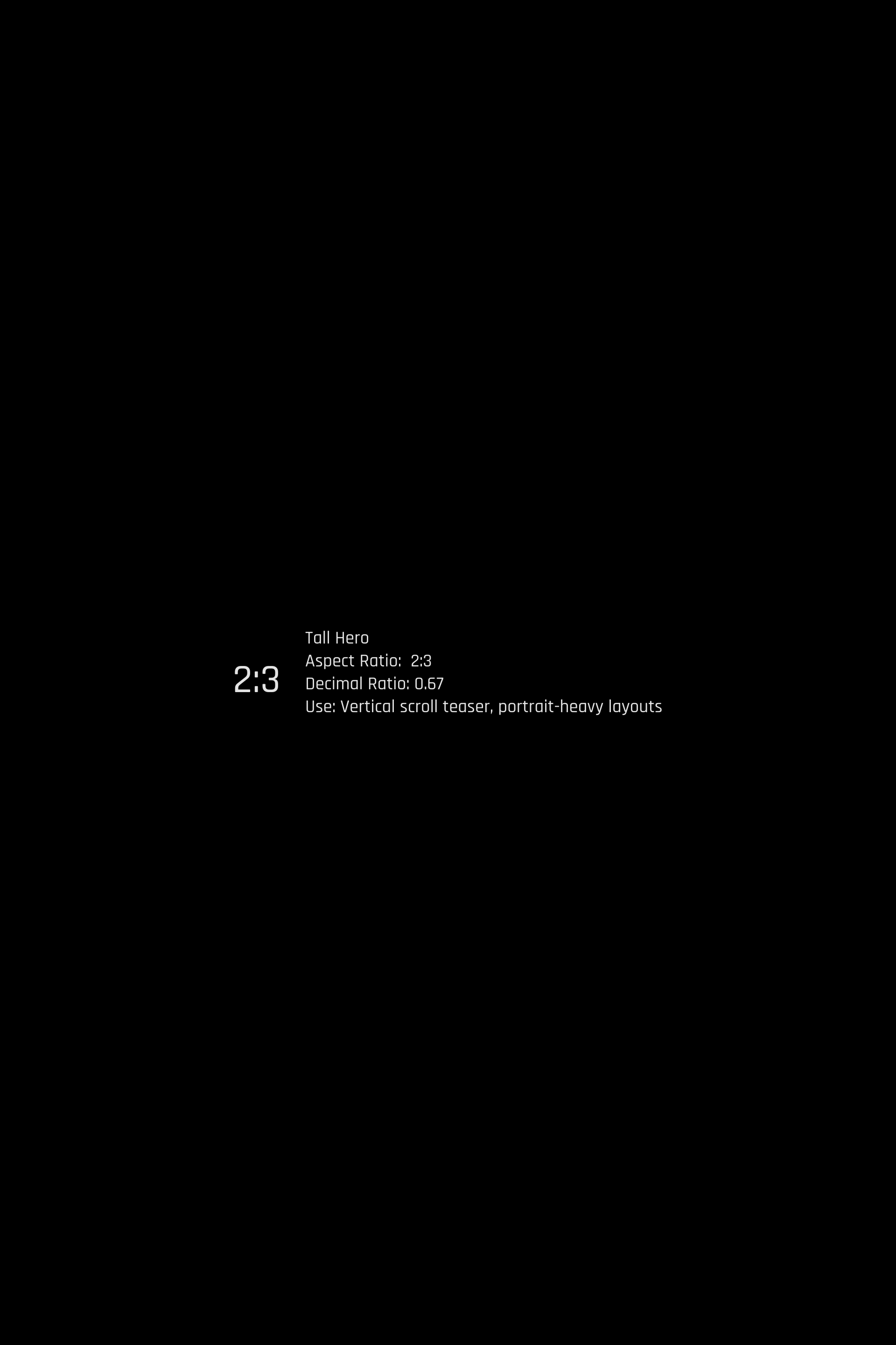
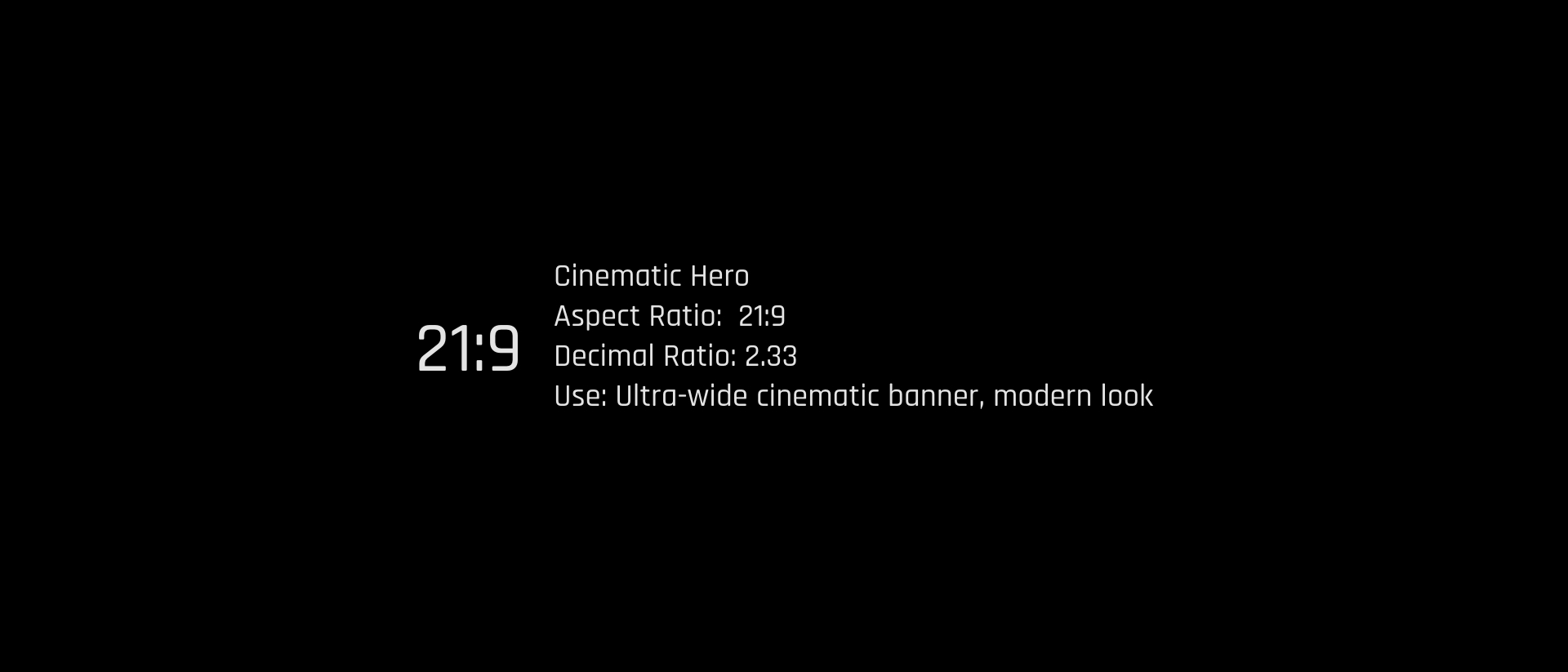
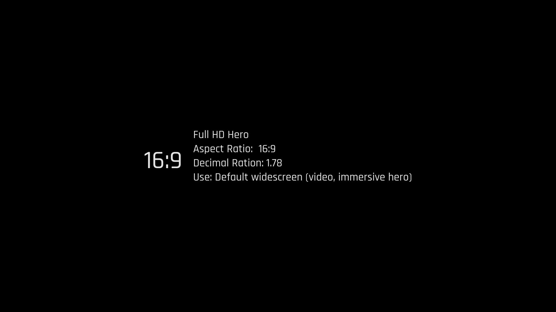
Image Ratios (testing)


